PlutoPay is a financial mobile application design which allows users to transfer money locally and internationally as well as manage their budget, cancel subscriptions, and make in person mobile payments. This project was completed as a part of my UX Immersion course at CareerFoundry. As the sole UX designer, I designed this project from inception to final design through research, ideation and UX design principles.
Tools
Adobe XD
Adobe Illustrator
Adobe Photoshop
Optimal Sort
UsabilityHub
Google Forms
Miro
Note.ly
Duration
8 months
Final Prototype
Problem
PlutoPay users are in desperate need of a way to make the struggle of tracking and managing finances a lot simpler. They look at their bank account at the end of the month and wonder where their money went. They are frustrated because they are usually trying to save up for something whether it’s to get out of debt, for a new washing machine, or to build up their savings. PlutoPay users are also frustrated relying on multiple mobile apps to take care of their financial needs. PlutoPay users need an app that helps them feel more in control of their money.
We will know this to be true when multiple users report that they are able to save 20% more per month with ease and that it is more convenient and beneficial to use PlutoPay than to pay with a credit card.
Solution
The mission for PlutoPay was to design an app that would enable anyone to meet all of their financial needs in one place by allowing users to shop, transfer money, manage their budget, track finances, and more without the need to visit a physical bank or the usage of multiple finance apps.
Many people today use an app for mobile transactions, a different one for managing their budget, a different one for managing money in their bank account, and carry a debit/credit card from their bank for places that only accept card payments. By providing a single app that can fulfill all of their financial needs, it simplifies a complicated aspect of life that causes people frustration and stress.
Strategy
PlutoPay can be a strong competitor to all mobile payment apps, budgeting apps, and banking apps. PlutoPay’s success will be contributed to offering a solution to complicated financing.
PlutoPay can implement incentives such as free PlutoPay cash for sharing with friends as well as discounts in select places that are interested in using PlutoPay as a marketing technique.
The Design Process
Research
With this problem and potential solution in mind I started to conduct some research to gather the necessary data to design an experience that will make the financial experience for potential users an easier one.
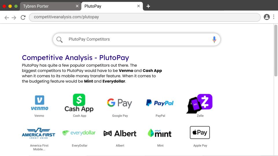
Competitive Analysis
PlutoPay has quite a few popular competitors out there. The biggest competitors to PlutoPay would have to be Venmo and Cash App when it comes to its mobile money transfer feature. When it comes to the budgeting feature would be Mint and Everydollar.
Survey
With the goal of better understanding users’ behavior when spending money and budgeting, I conducted a survey and was able to gather 50 participants. From the results of the survey, I was able to identify points of friction within other popular finance apps as well as identify the most important needs and goals of users when it comes to spending and budgeting.
Survey Insights
All users seem to use some sort of mobile payment service.
Less than half of users use a website or app to help them budget their money however 92% of users have some sort of way to budget their money.
The vast majority of users use a debit/credit card when at stores or restaurants due to convenience and simplicity.
The most popular mobile payment service app is Venmo because it is quick, easy, and free.
The most important features to be included in the app are quick money transfers, a way to pay all bills in one app, a detailed view of transaction history and account balance, & reminder notifications to achieve budget goals.
Interviews
In addition to the survey, I also conducted interviews over a phone call with 5 participants having the same goal in mind as the survey, but this time searching for more qualitative data rather than quantitative.
Interview Insights
All interviewees had mentioned being concerned about the security of mobile apps.
All interviewees seemed to have not invested a lot of time in creating and using a budget simply because they don’t have time, however, they had each acknowledged that they would like to have a budget because they know that would save more money by following a budget.
They each mentioned that they typically use different payment methods depending on what is accepted.
They had all expressed that while they are not ever worried about finances, they are all over the place and they would appreciate a customizable experience
After collecting data from the competitive analysis, the survey and the interview, I created some user stories that I could use to better understand the potential needs of users, to help decide on the functional requirements for PlutoPay, and that I could refer back to throughout the project to keep focused.
Define
After collecting all the necessary data from research, it was time for the analysis phase to draw insights from the data collected during the research phase, moving from “what” the users want/think/need to “why” they want/think/need it.
User Personas
I was able to identify in my research that there are many different lifestyles and needs among potential users so I created 2 user personas that would cover the majority of the target audience for PlutoPay. I revisited these user personas often in order to remind myself of the needs and frustrations of my users, and to maintain a user-centric focus for the duration of the project.
Mental Models
Using all of the research collected, I created a mental model for each user persona in order to understand how the user might interact with the app in different scenarios, and to create a more intuitive user experience.
Core Features
With a better idea of my user and their needs, I identified four core features that I wanted to focus on for the product.
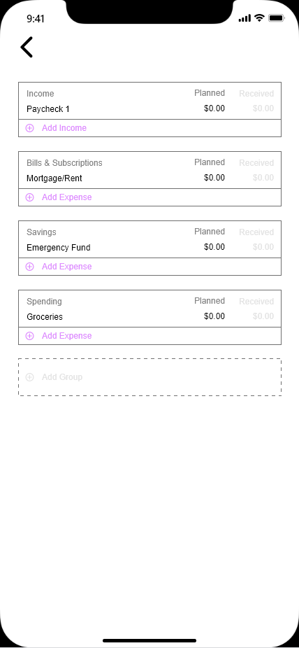
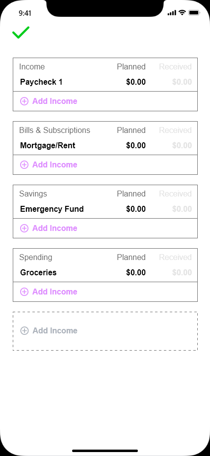
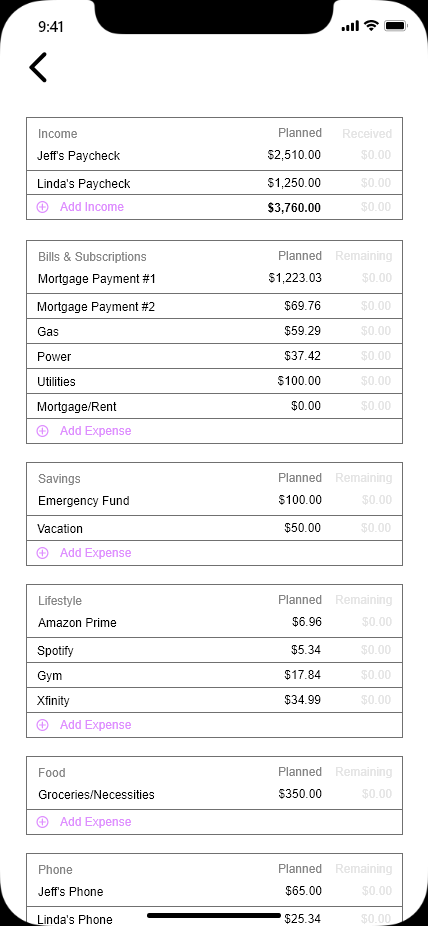
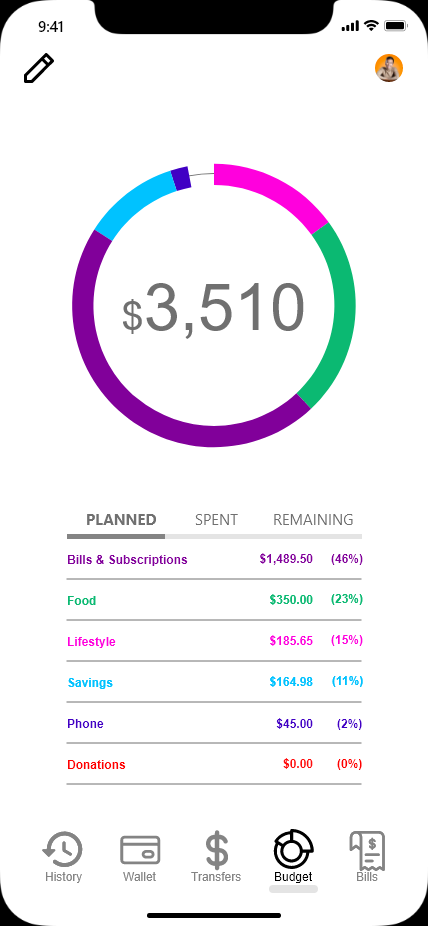
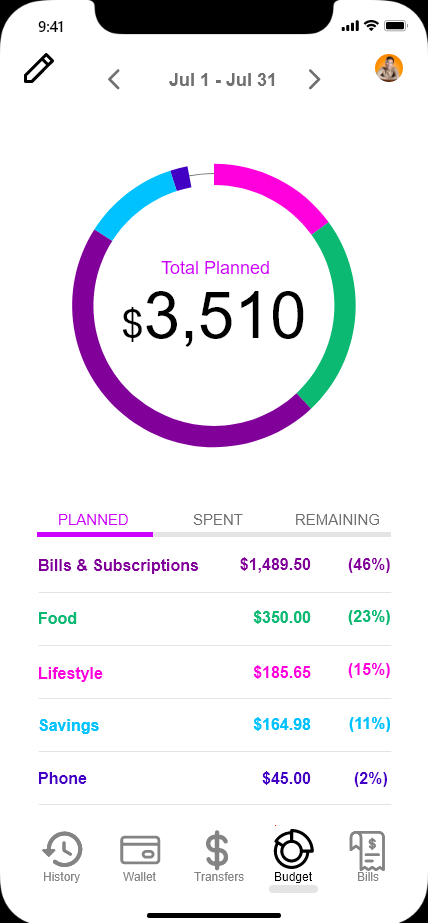
Budget Tool
Transfer Money
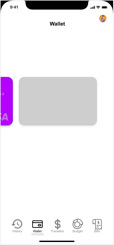
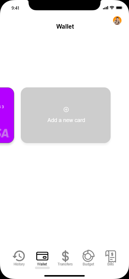
Mobile Wallet
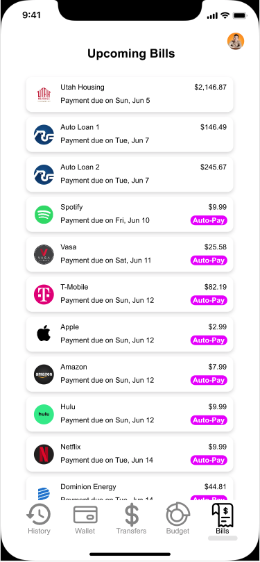
Manage Bills and Subscriptions
Budget Tool Allowing users to take control of their budget using the built-in budget tool.
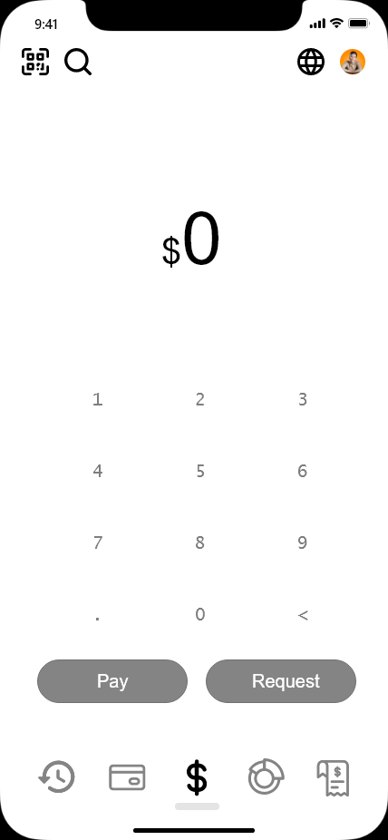
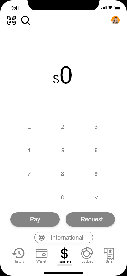
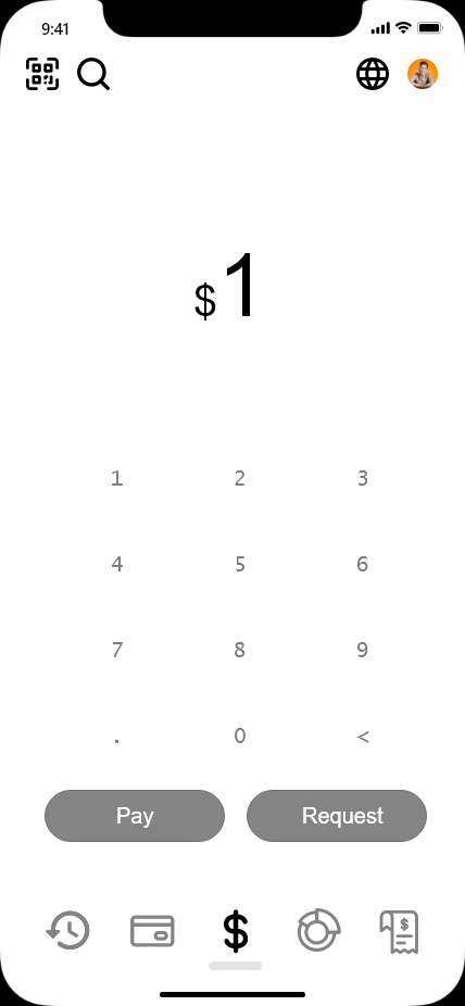
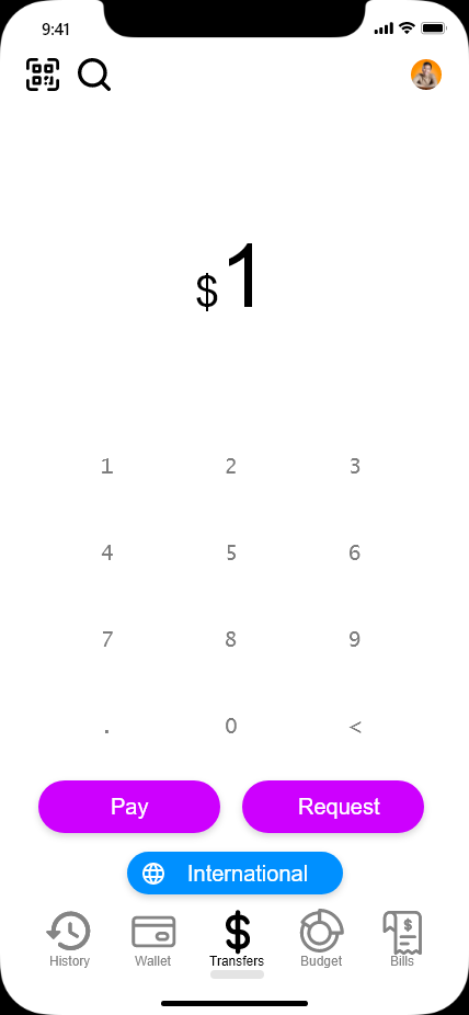
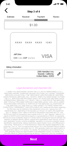
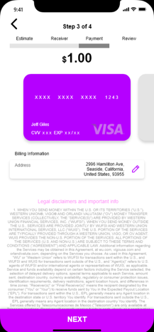
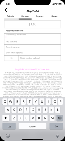
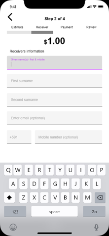
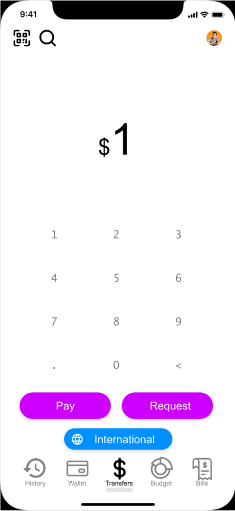
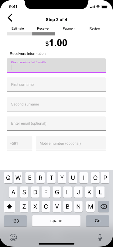
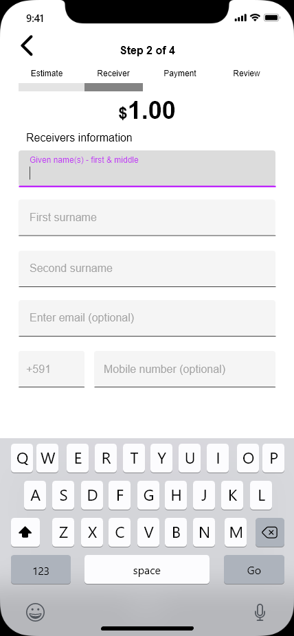
Transfer Money Allowing users to send money to family and friends locally as well as internationally.
Mobile Wallet Allowing users to pay using their cards in their digital wallet or to pay with a physical card that is linked to the app.
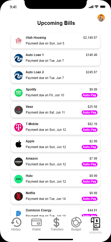
Manage Bills and Subscriptions Allowing users to manage, pay, or cancel their upcoming bills and subscriptions.
User Flows
With these core features in mind, I created some user flows to assist me in straightening out the user’s path to maintain the efficiency and simplicity of the design.
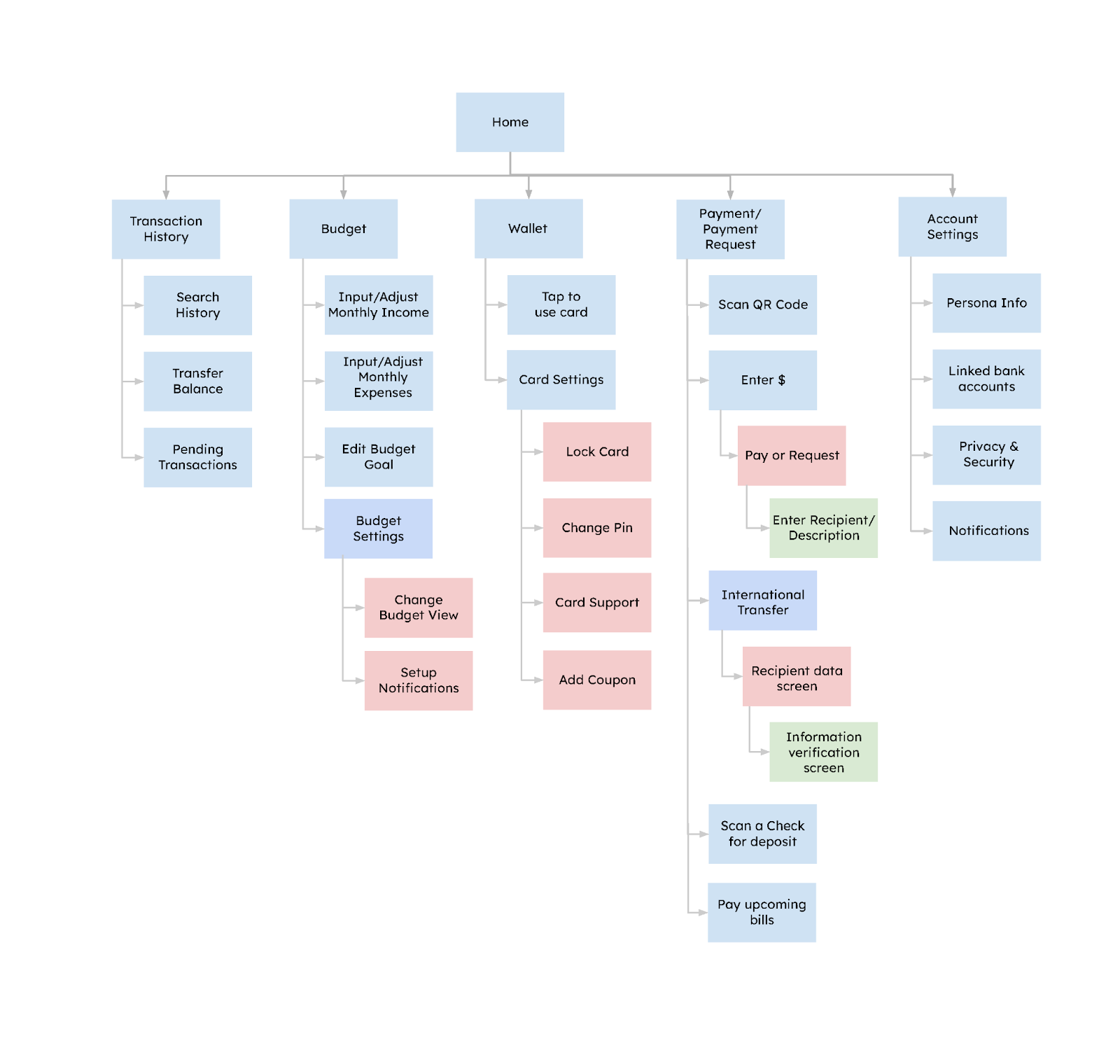
Sitemap
I also conducted a card sorting activity using the tool “Optimal Sort” to gain insight as to how users might expect the content to be organized and displayed, and used the results to create a sitemap.
Ideate
Once I felt like the users’ wants, needs, and expectations for PlutoPay were clear, it was time to move on to the design phase.
Low-Fidelity Wireframes
I started by making low-fidelity wireframes sketches on a piece of paper which allowed me to better visualize the idea of the design. I found that sketching the wireframes on paper for me was the most productive and flexible method to experiment while organizing the basic layout of the design.
Mid-Fidelity Wireframes
Once I felt pretty good about the layout of the low-fidelity sketches, I moved on to using Adobe XD to create some mid-fidelity wireframes which helped me to better pinpoint the sizing of different text fields and buttons while not having to worry about wording and colors.
High-Fidelity Prototype
Once I felt pretty good about my mid-fidelity wireframes, it was time to start creating a high-fidelity clickable prototype. Below is an example of the first version of my high-fidelity prototype.
Prototype and Testing
Usability Test
Once my high-fidelity prototype was complete, the next step was to carry out some usability tests with the goal of identifying problems or points of friction in the design, uncovering opportunities to improve the design and to learn about the target user’s behavior and preferences.
I was able to gather 6 people to participate in moderated in-person usability tests. The participants were informed the purpose of the study and asked to perform a series of tasks using the prototype. I recorded the session on another phone and organized the errors, observations, negative quotes, and positive quotes using Note.ly which was later translated to a rainbow spreadsheet to visualize the commonality of the pain points.
After the data was collected and organized and the rainbow spreadsheet was created, I identified the five most critical errors as well as the severity of issue:
Issue 1 – Participants selected upcoming bills icon instead of the budget icon. Medium Severity Suggested Change: Label the menu bar icons. Evidence: 50% of the participants selected the upcoming bills icon before selecting the budget icon. P3 suggested to label the icons.
Old
New
Issue 2 – Participants had a hard time locating the international transfer icon. High Severity Suggested Change: Move the international transfer button closer to the pay button with text. Evidence: All of the participants struggled to find the international transfer button initially. P2, P3, & P5 suggested to maybe label it so it is easier to identify. P1 & P4 suggested to move it closer to the pay button.
Old
New
Issue 3 – Edit budget cells are too small for the participants’ fingers. High Severity Suggested Change: Label the menu bar icons. Evidence: 50% of the participants selected the upcoming bills icon before selecting the budget icon. P3 suggested to label the icons
Old
New
Issue 4 – Participants weren’t sure what to do when finished with creating their budget. Medium Severity Suggested Change: Label the menu bar icons. Evidence: 50% of the participants selected the upcoming bills icon before selecting the budget icon. P3 suggested to label the icons
Old
New
Issue 5 – Participants wanted to push pay before entering the amount. Low Severity Suggested Change: Label the menu bar icons. Evidence: 50% of the participants selected the upcoming bills icon before selecting the budget icon. P3 suggested to label the icons
Old
New
Conclusion All of the participants were very satisfied with the overall layout and how easy the app was to navigate. The participants were all able to complete the task scenarios that were given to them. The changes made as shown above removed the biggest pain points which will increase the user satisfaction.
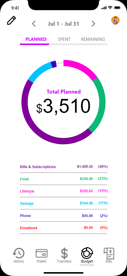
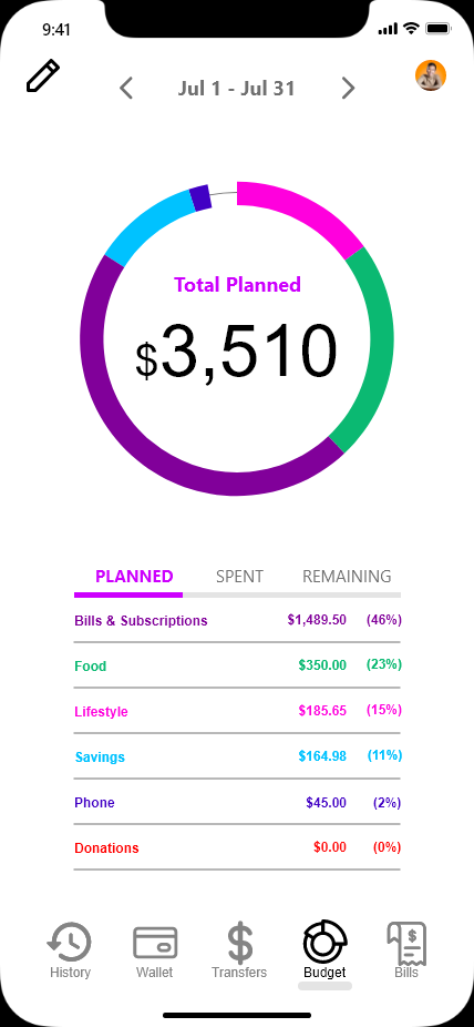
I also conducted a preference test to figure out if a slight change to the budget overview screen was necessary. Option A was the original layout. The changes that were made in Option B were to add the option to scroll between different month’s budgets, to raise the view tabs to the top, and to label the dollar amount inside the budget wheel.
Test Results
33 Total Participants: 4 Votes for Option A (12%), 29 Votes for Option B (88%)
The only comment that recommended changes was the following.
“I liked the tabs if planned, spent, and remaining in the middle on the other choice however the date range is crucial.”
The prototype was updated with “Option B: Revised” as shown below:
Option A
Option B
Revised
Option A
Option B
Option B: Revised
Based on the results, I decided to keep the tabs in the center of the page as suggested and to keep the rest of the features of Option B since it was by far the most popular choice. The changes were made to the prototype.
Material Design Principles
Material Design is Android’s version of the iOS Human Interface Guidelines. Material Design provides a great system and set of guidelines, which you can use to better your work even when you’re not working on a native Android app. Characterized by its flat, clean style, Material Design has been gaining popularity, and shares a great many visual examples of dos and don’ts.
There were quite a few iterations that I made after my study of Material Design.
Select Card
Elevation shadow behind the debit card helps indicate a card.
Elevation shadow behind the address card as well as the purple pencil icon helps indicate that its contents are editable.
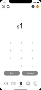
Removed border around the $1 as it can be confused as a button.
Added color to debit card to express high emphasis.
Enter Recipient
Changed the text cells to filled text fields to align better with material design principles.
Changed the color of the text field to provide a clear affordance for interaction.
Enlarged the text fields for ease of use and recognition.
Removed border around the $1 as it can be confused as a button.
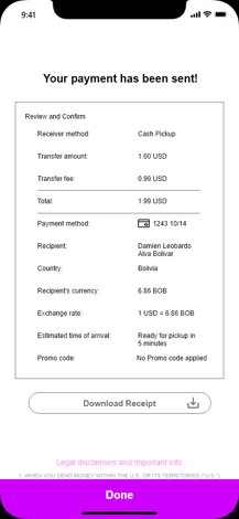
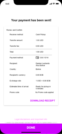
View Receipt
Elevation shadow behind the receipt helps indicate a card.
Changed the style of the download receipt button to a text button to express less emphasis since it is a less-pronounced action.
Capitalized the text on the “DONE” button to distinguish from other elements.
Style Guide
New Iterations Based on Feedback
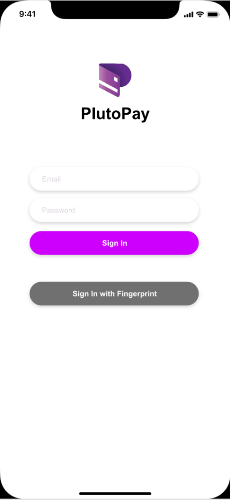
Login: AGREE
Feedback:
Try making the text bigger as it is kind of hard to read.
The colors are very nice, but adding email and password out of the text field, helps to remind users what they are filling out as when you click on the form the text “email” and “password” would disappear.
There isn’t a “Sign Up” button, only a sign in.
Reason:
The text could definitely be enlarged to enhance the readability of the text fields and buttons since the text is small and there is space to make the text bigger even without changing the button sizes. When the user taps on the text field to enter their email address and password the user could forget what they are entering. Rather than the user clearing the text to see what information is wanted, a reminder would reduce the cognitive load. Also I agree with adding the sign up button.
Old
New
Old
New
Transfers: AGREE
Feedback:
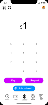
The CTA’s on the bottom of the screen could have a little more spacing, (the space between the pay/request and “international” button) feels a little to cluttered
Reason:
I could see how this is an issue since the Pay/Request actions are very different from each other. Rather than increasing the spacing between the buttons, including a drop down box above the number keypad would also resolve this issue.
Old
New
Old
New
Budget: AGREE
Feedback:
The colors are wonderful, however, try making it a little bigger, or editing the spacing between letters as it is hard to read.
Reason:
The combination of this font and size do make the text a little difficult to read. The text could definitely be enlarged to enhance the readability.
Old
New
Old
New
Upcoming Bills: AGREE
Feedback:
Very clean and nice with the Logos. However, try adding hierarchy to these. Bold or make the font more prominent for the business name.
Reason:
Adding hierarchy to the business names would definitely enhance the view of the bills and subscriptions.
Old
New
Old
New
Wallet: AGREE
Feedback:
Is this how you would add a new card? If so add a plus icon or something to help show this is to add a new card.
I’m not sure if the grey card on the right is for. I would also consider to add some sort of CTA for adding a card right when the user accesses the wallet feature. (similar to Apple Wallet where a CTA on the top right easily gives the user that option.)
Reason:
This feedback is very valid because there is nothing on the screen indicating that the grey card would be to add a new card. Also adding coachmarks for the first time accessing the wallet feature indicating the add card feature would help.
Old
New
Old
New
International: AGREE / DISAGREE
Feedback:
Check the contrast with the font size and color. It’s too hard to read.
Same with the sign-in screen add a way for the user to continue to see what the field is supposed to contain so they don’t become confused if they forget.
Check the contrast of font size and color, it’s too hard to read.
Reason:
I agree with this feedback. The font of all the text could be changed to one that is more legible and can be enlarged a little bit. I disagree with the 2nd comment since it is already implemented in the design but for presentation purposes the text is autofilled.
Old
New
Old
New
Designing for Accessibility
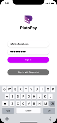
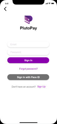
Sign in
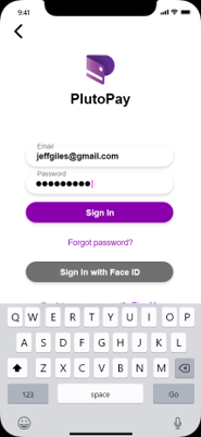
The first accessibility issue that the sign in screen had was with the contrast ratio of the purple button and text. To fix this issue I increased the contrast by making the purple color darker. I followed this same color pattern throughout the entire app.
The other accessibility issue with the sign in screen was that when a user would input their email and password in the text fields, the field descriptions would go away. In the improved design, I made sure that the field description will continue to float above the text box.
Old
New
New
Old
New
New
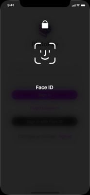
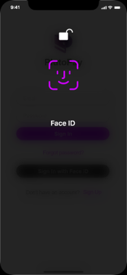
The other change that I made to the sign in screen was I added the ability to sign in with Face ID for a faster and easier sign in experience for frequent users.
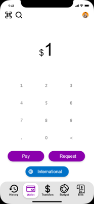
Transfers
This screen also had an issue with the contrast ratio of the purple buttons and International button. To fix this issue I increased the contrast by making the purple and blue colors a darker shade.
I also increased the contrast on the menu bar to draw attention and to more distinctively tell which screen the user is on.
Project Reflection
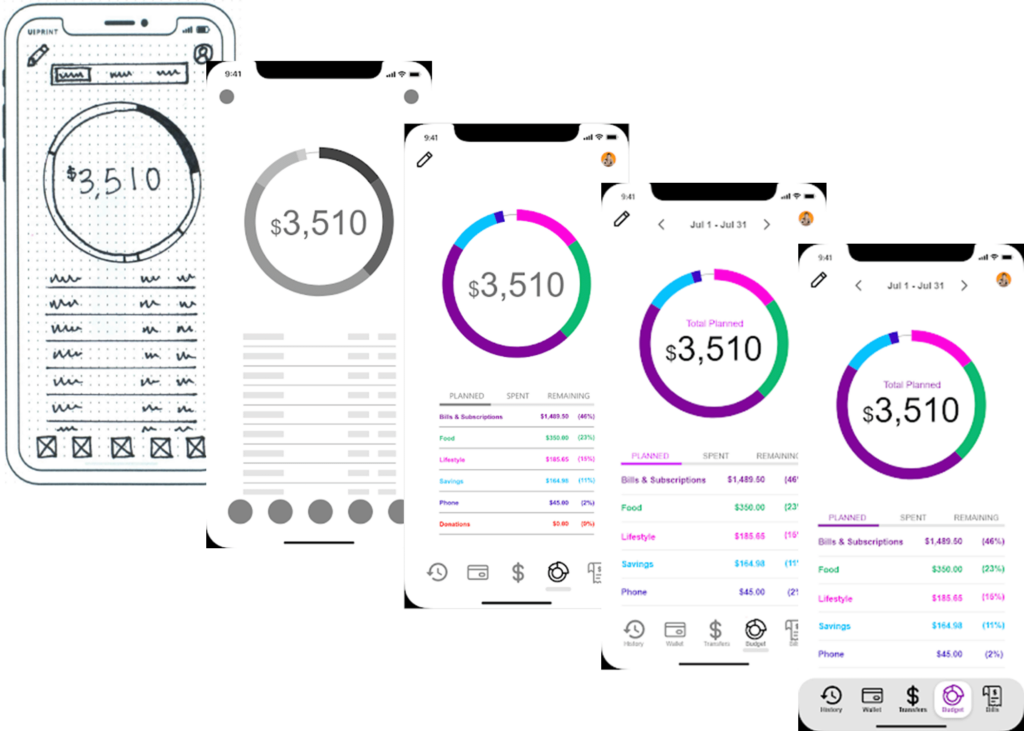
After going through all of my earlier drafts of PlutoPay, I noticed that the design has come a long way. PlutoPay was originally an idea, to make the ultimate finance app. After conducting research, features such as money transfers, international money transfers, digital wallet, budget tool, and managing subscriptions/bills were very highly demanded. After a lot of effort put into cardsorting/sitemapping, wireframing, testing, and polishing the design, the design has become much more usable and accessible. I was able to learn by prototyping and user testing how good UX designers are continuousl improving their designs. I also learned that it is okay to expect to make changes to the original design idea. Below is an example of how the budget screen went from a sketched out wireframe on pen and paper to a high-fidelity design that was modified after several user tests and iterations.
")


