The primary objective is to motivate people into an exercise routine that suits their level, schedule, and interests by designing an accessible and esthetically pleasing web-app.
Methods Information ArchitectureUser StoriesUser FlowsWireframesPrototyping
Tools FigmaAdobe IllustratorAdobe PhotoshopSmartMockups
Duration 2 months
Finding exercise routines for your level can be difficult, especially if you want to try something new. Finding routines that fit into your schedule is even more difficult.
Solution
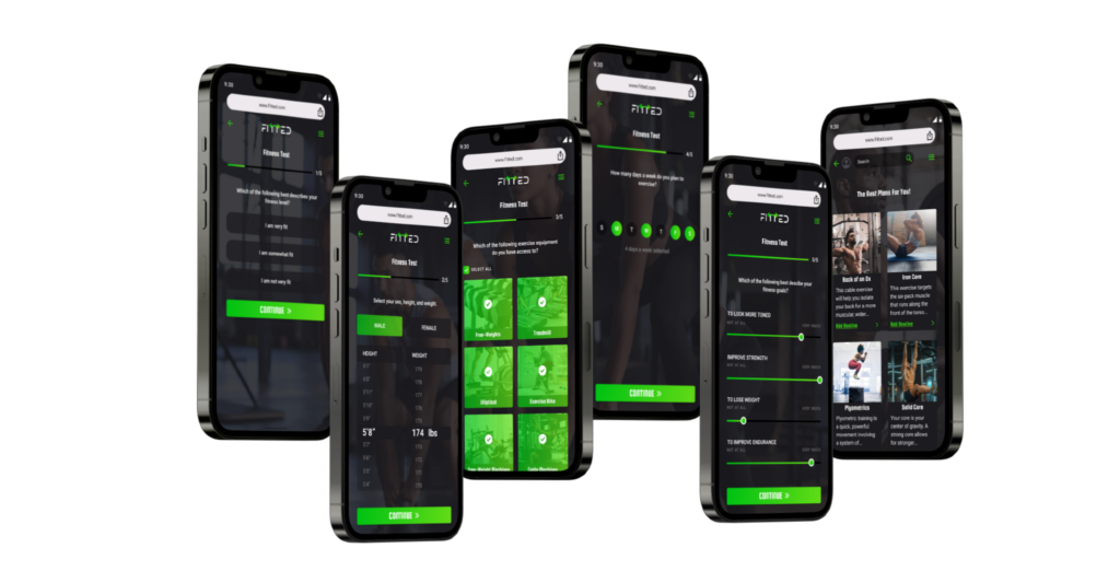
This responsive web app aims to help people get into an exercise of their choice by holding their hands a bit and providing routines, guides, interactive examples, and info. The web app is designed to encourage people who want to get into an easy routine for physical activities. This means fitting in as little as a 5-minute routine.
The Design Process
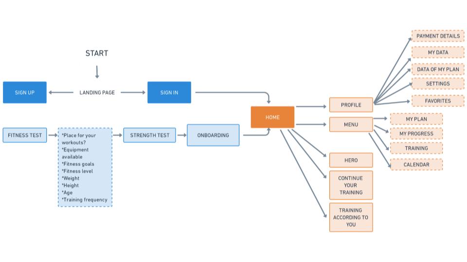
Information Architecture
After reading the project brief, I created a layout of the information archetecture of the design to get a general idea of the paths a user may take.
User Stories/Flows
Wireframes
Low-Fidelity Prototype
Applying Spacing
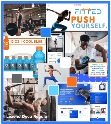
Mood Board
Mood Board #1
Mood board #1 to me has that blue color that has got to be the most common app color, with orange as an accent color. This could also create an accessibility challenge because the colors can’t really be used on top of each other. It can be difficult at times to have 2 equally bright primary colors, and you’ll find they compete for attention.
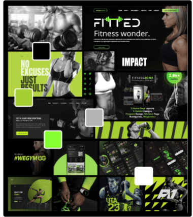
Mood Board #2
I liked Mood Board #2 a little more because I feel it is more unique and kind of gave me Spotify vibes. I think choosing one color as a primary palette color is a great idea. I also think green can reflect growth and energy which which is aligned with the goals behind fitness apps. I feel that overall this mood board best reflected the project brief.
Testing Different Color Palettes
Color Palette 1 – This complementary color combination looks beautiful but I think this combination is commonly used. I also think that the blue color gives off more of a calm vibe which isn’t the vibe that I want the app to give off since it needs to be an app that is motivational. Color Palette 2 – I really like this monochromatic color combination with the green accent. It reminds me of spotify however I think it gives off a vibe of growth and energy which can motivate users. I do think I will to continue using this color palette however I will consider adding a hint of green blurred into the dark background to give it a little more depth.Color Palette 3 – I really like the color combination of color palette 3 however, to me it gives off a more outdoorsy vibe since the color combination appears to reflect a sunrise with water which would be great if this design was for those who like to mountain bike, hike, etc. In summary I believe that this is a great split color combination however I do not think it fits the vibe of this design.
Style Guide
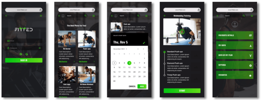
Mockups
Final Prototype
Thanks for reading!